Ready for a coffee break? Us, too. We love a good cup of joe, and this appreciation led us to wonder what coffee industry emails (from brands like Starbucks, Illy, Counter Culture, Peet's, Blue Bottle) looked like. Our first discovery was that most coffee brands don't send a massive number of email campaigns! Nothing like, say, fashion and e-commerce brands. But, there are a few gems that we're excited to share, and we want you to send us your favorite coffee emails, so we can add them to the mix, too!
Blue Bottle Coffee
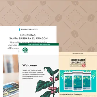
Subject: A Newly Discovered Cultivar with an Unusual Name

This bright, beautiful email from Blue Bottle Coffee made our mouth water. That hero image is stunning! It's also relatively generic and could even be a stock image, which just goes to show that you can build a beautifully designed email without any custom artwork.We like the one-line opener positioned above the hero image, instead of below it, in a traditional inverse pyramid layout. The text is large, minimal, and easy to read. The whole email is also based around a single message, with just one module of secondary content. This is an effective way to communicate with busy, on-the-go (and caffeinated) readers!One thing we'd change: The text must be live! Georgia is a web-safe font and would be a great way to break up the images. And the CTA button, of course, should be bulletproof.
Red Rooster Coffee Roaster
Subject: NEW COFFEE + NEW SCORE!

We've come to expect the background color for most emails to be plain white, so it's a pleasant surprise to find apale peachy color in this Red Rooster Coffee email. It's light enough that the black text has plenty of contrast and is easily read. Plus, the email has a lovely web-safe Courier font, which offers a vintage typewriter vibe that pairs nicely with the sans seriffont used in the logo and headers.Another small but important design detail we appreciate is the underlined links. Underlining links makes your email more accessible to readers who have visual impairments, which is so important! (Read more about accessible email design from Email on Acid's John Thies).
The Coffee Bean & Tea Leaf
Subject:Everyone loves free shipping ☕

We're a sucker for a good pun, and the opener of this Coffee Bean & Tea Leaf email made us smile. The email is a solid image, which isn't a design best practice, but we appreciate the smart art and copy that went into this messaging.Pro Tip:In the BEE editor, you can upload a big background image like this one, then place live text and a bulletproof CTA on top! This will make your email more inbox-friendly, particularly for mobile viewers! Check out our tutorial on adding background images in email.
Stumptown Coffee
Subject: Special delivery: new Indonesian coffees for April

Gorgeous green! That was our first thought upon opening this email from Stumptown Coffee. We love that the green background only exists behind the photo collages. If the entire email were green, it'd have a darker, potentially more claustrophobic vibe. But using a light gray background for the body of the email does wonders to provide balance.While these photo grids are actually single images, they could also be arranged individually in responsive photo grids. Still, this email is well-balanced with plenty of padding between content, a CTA button that passes the squint test, live text, and underlined links!
Starbucks
Subject: Welcome to Starbucks

This Starbucks email isn't the most exciting in the world, but we thought it was beautiful and unexpected. It's not often that an email lands in our inbox without a strong call to action—and we usually don't advocate for that approach—but this simple welcome email was a pleasant surprise. Starbucks is very clear and straightforward in confirming what the reader signed up for, both in the green banner and in the body text, and while this email may not garner clicks, it does help establish transparency and brand loyalty.
La Colombe
Subject: Favorite Mexican Coffee

One of the first things we noticed about this La Colombe email is its color scheme. The brand's blue, red, and yellow colors—along with white in the background and as an accent—all play nicely together and provide a bit of a pop. The brand is also using the quirky content block approach we first talked about last year, which offers a playful, creative vibe. And, the map illustration stands out! Still, like emails from other coffee brands, this one would benefit from more live text, whether between the images or on top of them.
Build your own photo grid email & get creative with HTML background colors!
Not to toot our own horn, but...if you try a free BEE Pro trial, you'll get access to our super intuitive drag-n-drop email design tool, in which every email you make will be mobile responsive. You'll also get access to our huge library of gorgeous stock photos, plus all the tools you need to design a beautiful email—without needing to know any code. We hope you give BEE Pro a try, and cheers to happy designing!