The myth: Designing accessible emails is hard
When most people hear “email accessibility,” their first reaction isn’t excitement. And for valid reasons! When you start digging into all the rules, guidelines, and technical jargon, email accessibility starts to feel anything but accessible.
We hear it all the time: “Designing accessible emails is complicated,” or “I’m not a developer, I’ll never get this right.” But accessibility isn’t about writing lines of code or mastering obscure standards. In fact, it’s easier (and more rewarding) than you might think.
In our most recent webinar, we brought together some of the sharpest minds in email to break down what’s trending, what’s working, and what to stop doing immediately for more accessible emails.
The reality? It’s not hard; there’s just a lot of information out there.
Today, we’re cutting through the noise and answering your burning questions about email accessibility. You know, the ones that keep you up at night, like:
- “What’s the right way to write alt text?”
- “Are images with text a bad idea?”
- “Do I need to design separately for desktop and mobile?”
- “How can I test for accessibility without being an expert?”
Plus, all the questions in between that lead to the single misconception that accessibility is complex, technical, and time-consuming.
What kind of description should I include in the alt text?
ALT text is what screen readers use to describe images to people who can’t see them or the text displayed when images don’t load. Some key considerations include:
- Match your alt text style to the purpose of the image.
- Avoid starting with “image of” as assistive tech already identifies it as an image.
- Keep it short and relevant to the message.
Example:
❌ “Image of a coffee mug.”
✅ “Barista pouring a latte for a smiling customer.”
How detailed should ALT text be for images?
Not every image in your email needs the same kind of description. Here’s how to approach different cases:
- Decorative (icons, backgrounds, emojis): If the image doesn’t add meaning, leave the alt text empty so that assistive technologies can skip it, and there are no unnecessary “star icon” interruptions for the user.
- Informative or promotional image (product photos, sale banners): When the image communicates information or purpose, describe what it shows and why it matters.
- Emotion-driven or contextual: Sometimes images are there to create a mood; your alt text should summarize that emotional tone or story. For example, if the image is of people high-fiving after a team success, your alt text can be "Coworkers celebrating a successful project launch."
- Complex charts or infographics: For data visuals, don’t attempt to describe every number or bar. Instead, summarize the main takeaway or trend. For example, if your infographic illustrates: a bar chart comparing Q1 vs. Q2 sales, your alt text can be “Sales increased by 25% in Q2 compared to Q1." This provides the conclusion, not the entire dataset.
Are there character limits for alt text?
Most email clients truncate alt text after 125–150 characters, so be concise. Think caption-length clarity, not paragraph-length prose.
How do I handle alt text in images that have overlaid text?
It’s tempting to use custom fonts or stylized text inside an image, especially for brand flair. But screen readers can’t read text that’s embedded in an image. If your company operates globally, this is even more important as embedded text can’t adapt to localization or character sets.
If you do include overlaid text, your alt text should capture the written message verbatim, rather than describing the picture behind it.
Example: If there is an image with a photo of a phone with the words “Download the App Now” on top, the alt text should read:
✅ "Download the app now."
❌ "A phone on a desk with the app screen showing."
What are the best fonts for designing accessible emails?
Sans Serif fonts are great for designing accessible emails because they are simple and easy to read on screens of all sizes. Web-safe fonts, like Arial, Helvetica, Verdana, or Open Sans, are your accessibility best friends. These are fonts that are pre-installed across most operating systems, ensuring consistent display even if the email client doesn’t support custom fonts.
How to choose the best font for email: https://beefree.io/hub/html-email-creation/best-font-for-email
How do I handle custom or branded fonts (where not all clients support them)?
If your brand guidelines call for a custom typeface, make sure you set a web-safe fallback font in your code or design tool. That way, even if your primary font fails to load, the user still sees clean, legible text. Beefree does this automatically, but if you’re not using Beefree, here’s an example fallback stack: font-family: 'Open Sans', Arial, sans-serif;
Gentle reminder that Sans Serif fonts don’t have to feel generic. You can pair a classic, accessible base font with subtle style accents, like slightly larger subheadings, all-caps CTAs, or bold pull quotes, to add personality without compromising readability.
How can I make small or secondary copy more accessible?
We’ve all been guilty of shrinking terms and conditions into tiny, italicized footers. The issue? Small, low-contrast text is hard to read. We recommend:
- Sticking to a minimum of 14px for body text, 12px only for legal fine print.
- Using regular or semi-bold weights instead of italics for clarity.
- Keeping line height around 1.5x the font size for readability.
Sneak peak: Beefree's Smart Check will soon suggest enlarging fonts smaller than 14px.
Is it okay to mix fonts?
Yes, but keep it simple. One for headers (attention) and one for body copy (readability). Consistency reinforces brand identity and accessibility.
How do different email clients treat dark mode?
You’re not imagining it, dark mode rendering really does vary wildly from one email client to another.
- Apple Mail tends to automatically invert background and text colors.
- Gmail may preserve your background color, but it will darken your text slightly.
- Outlook often goes rogue and reinterprets color values entirely
So, it’s completely normal to feel like dark mode has a mind of its own. We often get asked, “What’s the workaround for dark mode email campaigns?” (especially during our recent Email Design Trends: Accessibility Edition webinar).
Here’s our answer: Instead of trying to force your light design to look the same in dark mode, focus on flexibility and contrast. A few tried-and-true strategies:
- Use stronger contrast for text, buttons, and key calls to action.
- Reserve your softer brand hues for backgrounds, dividers, or accent elements.
- Pair muted colors with neutral foundations
How to keep brand colors consistent in dark mode
Unfortunately, you can’t completely control how any email client will reinterpret your palette. But you can guide it by:
- Avoiding large blocks of solid light color (they’ll invert).
- Avoid pure white (#FFFFFF) or pure black (#000000) — use off-white or dark gray neutrals instead (like #F5F5F5 or #121212).
- Build your palette around mid-tone colors that hold contrast when inverted.
- Use a neutral fallback color palette for essential elements, one that remains readable even if the brand's hues shift slightly.
- Defining background colors inline in your HTML (Beefree handles this automatically).
- Testing with Beefree dark mode preview before finalizing your send.
If your brand palette doesn’t play nicely with dark mode contrast ratios, prioritize legibility over purity. You can maintain brand recognition by maintaining consistent shapes, typography, and logo usage.
Beefree’s Smart Check automatically identifies text/background contrast issues that could affect readability.
Pro tip: Document your “dark mode color system,” a set of fallback values that align with your brand guidelines but meet accessibility standards. It saves time for every future campaign.
How to handle images, logos, and icons so they look good in both light and dark modes?
- Use transparent backgrounds (PNGs or SVGs) so your images adapt to both dark and light backgrounds.
- Avoid baking background colors into your images — that’s what causes halos or clashing edges when colors invert.
For logos, create two versions:
- A standard version (for light backgrounds)
- A reversed or light version (for dark backgrounds)
Does creating separate content blocks for desktop and mobile improve accessibility, or hurt it?
It depends on how you use them.
Creating separate blocks for desktop and mobile can help tailor your design — such as using larger images, stacked layouts, or simplified text on mobile — but too many hidden blocks can actually harm accessibility. Screen readers or certain apps may read both versions of your content, creating a confusing experience.
When should I use an image on a desktop but hide it on mobile?
Images that look stunning on desktop can feel cluttered or slow on mobile, especially if they contain text or large background graphics. Hiding those can improve both loading time and readability.
Keep an image if:
- It conveys essential information or emotion.
- It supports your message (e.g., a product photo, testimonial, or emotional hero).
Hide it if:
- It’s decorative and not meaningful.
- It slows down loading or makes your content hard to scan.
Rule of thumb: If your email still makes sense without the image, you can safely hide it for mobile.
How to design CTA buttons for mobile
Buttons that are too small or tightly spaced can easily lead to frustration or missed clicks. In Beefree, buttons automatically scale responsively and keep your text legible without extra code; however, if you’re designing with another builder some considerations:
- Make buttons full-width or at least 44×44px — the minimum touch target recommended by accessibility guidelines.
- Center them and leave generous padding around CTAs to avoid accidental taps.
- Keep button text short, clear, and actionable: “Get Started,” “Shop Now,” “See More.”
Mobile-friendly email design best practices: https://beefree.io/hub/html-email-creation/mobile-friendly-email-design
Best practices for designing accessible email
We’ve all seen stunning emails with rich photography, layered graphics, and clever text treatments. But even the most visually striking designs aren’t always the most inclusive. Accessibility doesn’t mean stripping away creativity; it means designing so everyone can experience it.
How can you balance accessibility with graphic-heavy or image-based emails?
Visual storytelling is powerful, but when your message relies entirely on images, accessibility can take a hit. Screen readers can’t interpret text baked into images, and if those images fail to load, your email becomes a blank canvas.
- Use live text (actual HTML text) for headlines, CTAs, and essential content.
- Use images to enhance your story — not be the story.
- Always include meaningful alt text so that your key message remains clear even if images don’t display.
Think of images as context, not containers. The text should tell the story; the visuals should amplify it.
Is it important to avoid picture-only emails (even with alt text)?
Absolutely. All-image emails are one of the biggest accessibility pitfalls and also a reliability issue. Many email clients block images by default, meaning your message could disappear entirely.
Even with perfect alt text, users miss out on layout, hierarchy, and emphasis.For accessibility (and deliverability), always include real HTML text for key information.
Golden rule: If your email only works when images load, it’s not accessible or effective.
What’s the deal with <table> vs. <div> layouts?
Traditionally, email design has relied on <table>-based layouts because they render consistently across clients (especially Outlook). However, <div>-based layouts, which are cleaner, more flexible, and more semantic, are gaining traction as modern clients improve.
- Use a hybrid structure: Tables for core layout reliability, <div> elements for styling and responsiveness.
- Ensure semantic markup: Proper heading tags, alt text, and role attributes) regardless of structure.
- Avoid nesting too many tables: This can confuse screen readers and increase email weight.
Beefree’s exported code utilizes clean, semantic HTML that strikes a balance between accessibility and client safety.
Why is VML considered bad for accessibility?
VML (Vector Markup Language) is a Microsoft technology used primarily for background images and shapes in Outlook. Unfortunately, it’s inaccessible by nature because screen readers can’t interpret it, and it adds unnecessary code complexity.
Beefree minimizes the use of VML automatically, generating clean fallbacks and semantic HTML so your designs stay accessible without sacrificing visual quality.
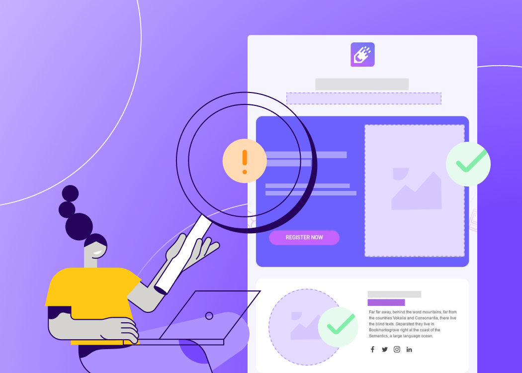
How do you test accessible emails?
Designing for accessibility is one thing, testing it is where the magic (and the learning) really happens. Testing ensures your emails don’t just look good on your screen but work well for everyone, regardless of device, email client, or ability. Here are some of the best tools to start with:
- WAVE (WebAIM Accessibility Evaluation Tool): A free browser extension that highlights accessibility issues directly on your screen.
- Screen reader testing: NVDA (Windows, free) or VoiceOver (macOS/iOS, built-in). This helps you hear your email the way someone using assistive technology would. You’ll quickly notice if your layout or content order feels confusing.
Email tools experts actually use to design more accessible emails: https://reallygoodemails.com/school/email-accessibility-made-practical
Incorporating accessibility testing in your email QA & pre-send workflow with Beefree:
Accessibility is recognizing that your audience isn’t one-size-fits-all and creating emails that everyone can enjoy, no matter how they read, click, or engage.
Instead of treating accessibility as a separate, technical task, Beefree integrates it directly into your creative process.
With features like Smart Check for instant color-contrast and alt-text validation, responsive previews that show how your email performs across devices and modes, and clean, semantic HTML exports, accessibility testing becomes as natural as checking your links or proofreading your copy.
When accessibility becomes effortless, creativity shines. The result? Better engagement. Stronger trust. Higher-performing campaigns that reach everyone.
Get started today and discover how easy it is to design accessible emails with Beefree.