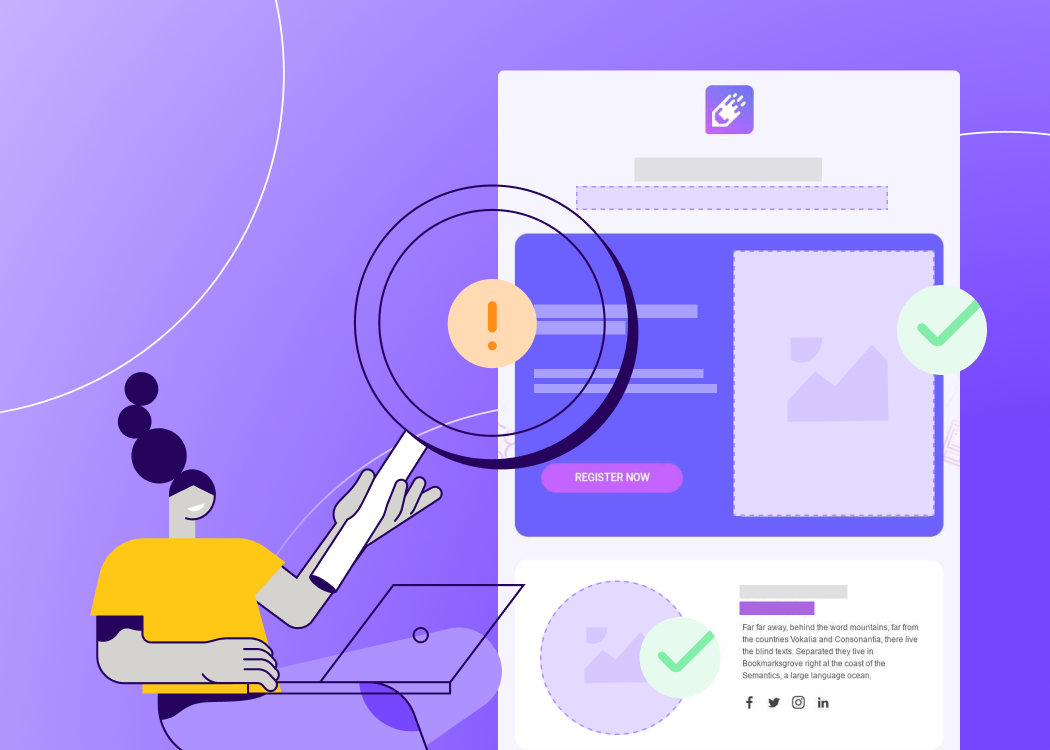
Wehave short attention spans. We multitask. We read our emailsin line at the store,while the TV playsin the background, and in the middle of meetings. That's why email messages need to be brief, focused, and easy to understand in a matter of seconds. Emails are not websites. Emails are "teaser content." If you make that content interesting enough, readers will tap to learn more.But we often see emails that are not optimized for readers'mobile, distraction-filled lifestyles. Old design habits die hard. When we recently looked at email design trends in the movie promotions industry, we weren't surprised to see a few emails that were out of sync with the mobile-optimized design techniques we continually recommend. This email, for example, from the movie ticket seller Fandango, could benefit fromsome email serious design updates.

The header is complex and takes up a lot of space; the “Buy Tickets” buttons are images (not bulletproof CTA buttons); and the dual-column layout doesn’t create any hierarchy or flow to Fandango'smessage. It also isn’t mobile-responsive, makingthose buttons especially tiny and tough to tap on mobile.

We recommend Fandangosimplifies, focuses, and prioritizes mobile viewing for on-the-go reading. In today's workshop, we'll show you how. Let's fix this email with BEE.Here's our video recap:
Switch to a single column
We're going to optimize Fandango's email for mobile viewing first by switching from a two-column email to a single-column one. As is evident with this email, multiple columns do not render well on smaller screens. Single column emails are easier to read and are betterfocused on a call-to-action (single columns areoptimal for storytelling, taking readers through each component of the message until there is a clear, obvious call-to-action). In the BEE editor, we'll begin redesigning the Fandango email with a one-column template.

Simplify the header
Emailheaders shouldn't be overcrowded. Remember, you're not designing a website. There's no need to include extraneous links(social media, special sales, etc), menus, and text at the top. The idea is to get into the important content quickly, guiding readers to your CTA and getting them to tap. Asimple, branded header is enough. Fandango's header hasthree tiers of information: the logo, a site navigationmenu, and a banner message about Memorial Day weekend.

We'd advise removing those links at the top and sticking with a simple, clean logo for the header. If there's something you really want your readers to click—your awesome teaser content—put it in section one and not in the header.

Here's our new email-in-progress with the Fandango image at the top:

To separate it visually from the body content below, we'll also pull in a divider line from the Content menu on the right.

Simple, elegant, branded!

Establish hierarchy
When we open the original two-column Fandango email, it's not clear what we should focus on. What's the most importantmessage? What is Fandango telling us, and what do they want us to do? Eachcontent modulecompetes with the others, and there isn't a clear hierarchy to determine what the primary CTA is. Compare that with this single-column email from Film Society of Lincoln Center.The first module has the largest image, and, well, it comes first. We see and read it first; even if we don't scroll down, our eyes probably landed at least on the information in the first section. That's where the most important information is.

So, what's the most important information in Fandango's email? It's not easy to say, but it appears to be the X-Men tickets. The X-Men module is situatedin the upper left—arguably the most visible part of the email—and the pre-header text reads "Get 'X-Men: Days of Future Past' Tickets + More." It seems, then, that we need toput this section first. From there, we'll make some guesses to line up the itemsthat should follow it.
Streamline modules and switch to bulletproof CTA buttons
With our assumption thatthe X-Men module is themost important piece of content, we're going to make it our first module. Because we want to give readers a single call-to-action, we're going to cut out the mini-menu underneath the X-Men image in the original email. We'll also shorten the description text and delete the duplicative "Buy your tickets now" language that exists already in the CTA button.

Here's how the new module looks in our redesign in BEE:

The whole email already has an entirely different feel: our attention is drawn right away to the X-Men announcement and we're led to our first call to action. In addition to simplifying the descriptive text, we also optimized our bulletproofCTA button to read "Get my tickets now"—a more compelling, personalized statement than "Buy tickets." Read all about how to make your CTA buttons irresistibly clickable in our post Top Tips for Call-to-Action Button Design.To improve the balance in the module, we'll also increase the width of the CTA button to line up with the image above it.

Adjust any CTA button in the Width section of your Content Properties menu.

From here, we can continue simplifying each module, creatingthem one after the other in our single-column design. We'll also continue using the BEE content dividers to separate oursections.Next up, we'll redesign this Your Theaters module.

But we don't want this bright orange header to compete visually with the bright orange CTA button that comes before it. Instead, we'll let this module have a white background color, like the one above it, and let the CTA button provide the color—and get the most attention. (You can use an HTML background color to separate amodule—check out our post Design tips for using background color in email). Here's the new design:

We again updated the CTA button text to include the personal pronoun "my" and to be in the same all-caps format as the first CTA. We were also careful to adjust the width so that it's the same as the previous button.
Preview the design on mobile
As always in the BEE editor, we can preview how our email is coming along by navigating to the Preview option in the Actions menu in the upper left. The new hierarchy and single-column design really shines on a smaller screen!

Continue with design simplicity
In the Fandango email, and in all emails, as we design each module, we'll continue to consider:
- What's the key message we need to communicate?
- How can we eliminate extraneous text?
- How can we emphasize a single focus by including only the most important call to action?
- How can we optimize the call to action, both in our language and in our visual style?
- How can we create simple section breaks to improve readability?
Note we are also only using one font while depending on size and styling (bold) to add emphasis. The email will continue using just blue and orange as the branded accent colors.When we come back to design simplicity again and again, we reinforce the focus and elegance of our email. The email doesn't need to include every last detail—it's not a website! Give these design tactics a try withyour own email in BEE, or recreate your own version of the Fandango email and tell us about it in the comments!