How do you achieve a full-bleed email layout design? How about if I want to instead limit the width of my layout for a more boxed appearance? These are two questions we get asked a ton from users of Beefree.
In today's workshop, we'll be showing you how easy it is to change the layout of your email design with a simple adjustment to the background and content color settings, but first let's take a look at a few examples. Our inbox is full of emails with both types of designs!
Full-bleed versus Limited-width layout explained
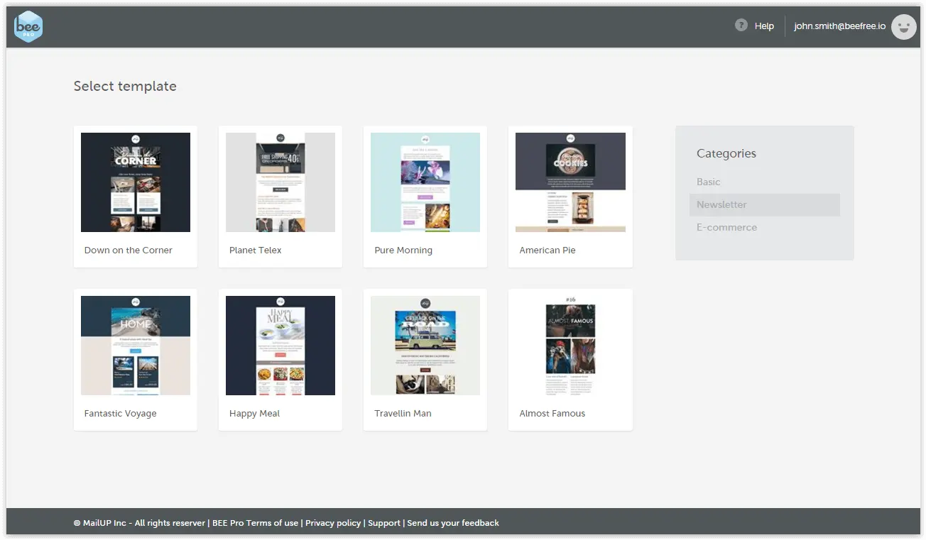
A full-bleed layout of your email has an edge-to-edge appearance and it extends to the full width of your screen, typically more noticeable on desktop and tablets. A full-bleed layout is sometimes also referred as full-width or edge-to-edge.On the other hand, a limited-width layout has your content boxed in within your email message. Intuitively, we sometimes call this a boxed layout, since the width of your email remains fixed in and doesn't stretch out.Here are a few examples of these two different layout designs from our templates available on Beefree. Notice that the American Pie and Fantastic Journey templates have a full-bleed layout design whilethe others, such as Pure Morning have a limited-width layout design.
Our inbox is full of emails with both the full-bleed layout as well as the limited-width one! Here are a few more examples of real email campaigns from brands.
Full-bleed email layout examples
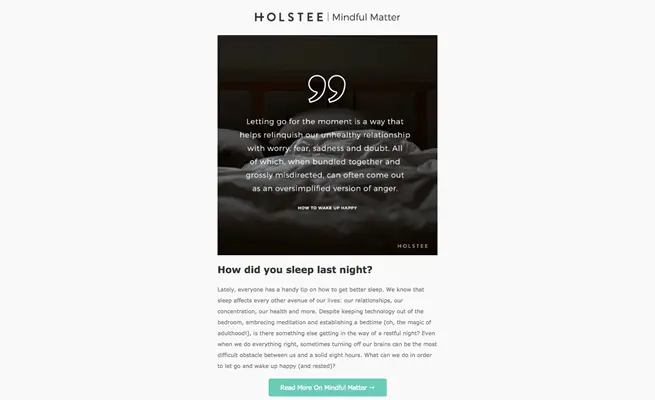
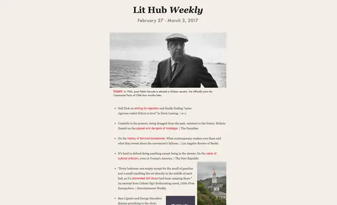
Check out these three recent examples of full-width email designs from Aperture, Holstee, and LitHub. Feel free to click on each image to zoom into the full email.
Aperture

Holstee
LitHub
Limited-width email layout examples
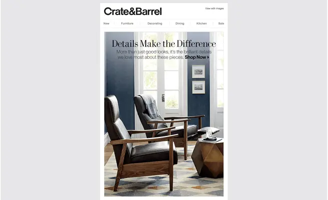
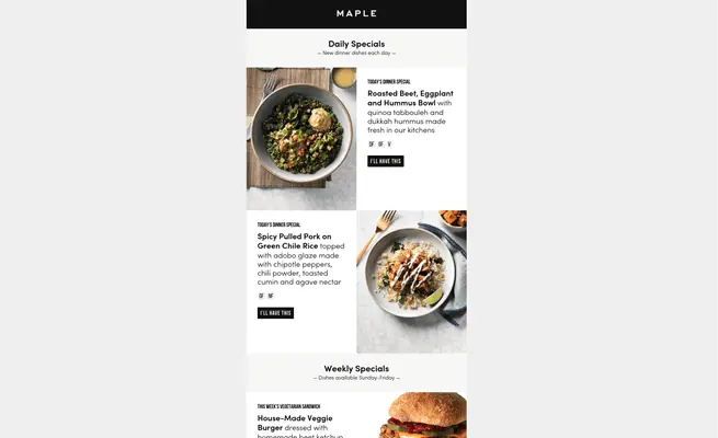
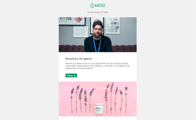
By comparison, boxed emails usetwo contrasting colors, one color behind the content and one around the content. As we'll see, light gray is a popular choice for background color. The boxed look narrows readers' eyes on the column of content, potentially improving focus and legibility.Here are three examples with emails from Crate & Barrel, Maple, and Moo. Again, feel free to click on the images to zoom in to see the full email.
Crate & Barrel
Maple
MOO
Which email layout is better?
So, which layoutis better? That's a trick question. Both can be effective, and the best way to find out if your audience responds more or less to a particular style is to run A/B tests on your email design. Whichever method you choose, your design should always be mobile responsive. And, if you're already using Beefree, all emails you create will automatically be responsive to mobile devices.Keep reading to learn how to quickly and easily change your email design layout!
Today's workshop
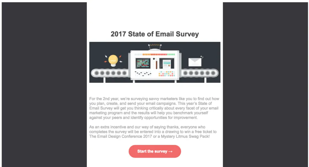
In today's workshop, we're going to recreate a recent email from Litmus, shown below. This email currently has an edge-to-edge full-bleed design. Let's walk through how to create this look with the Beefree editor by using HTML background colors.If you're not already using Beefree, get started with our free plan!
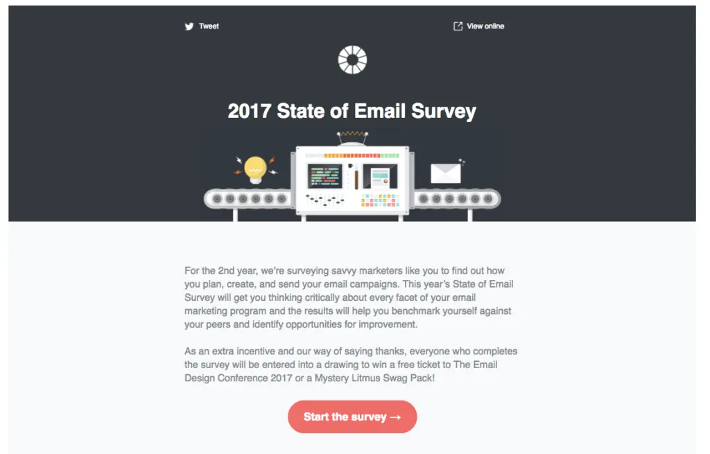
How to create a full-bleed email design
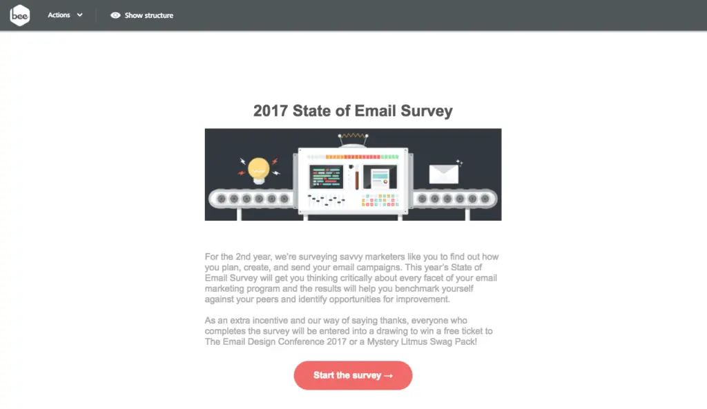
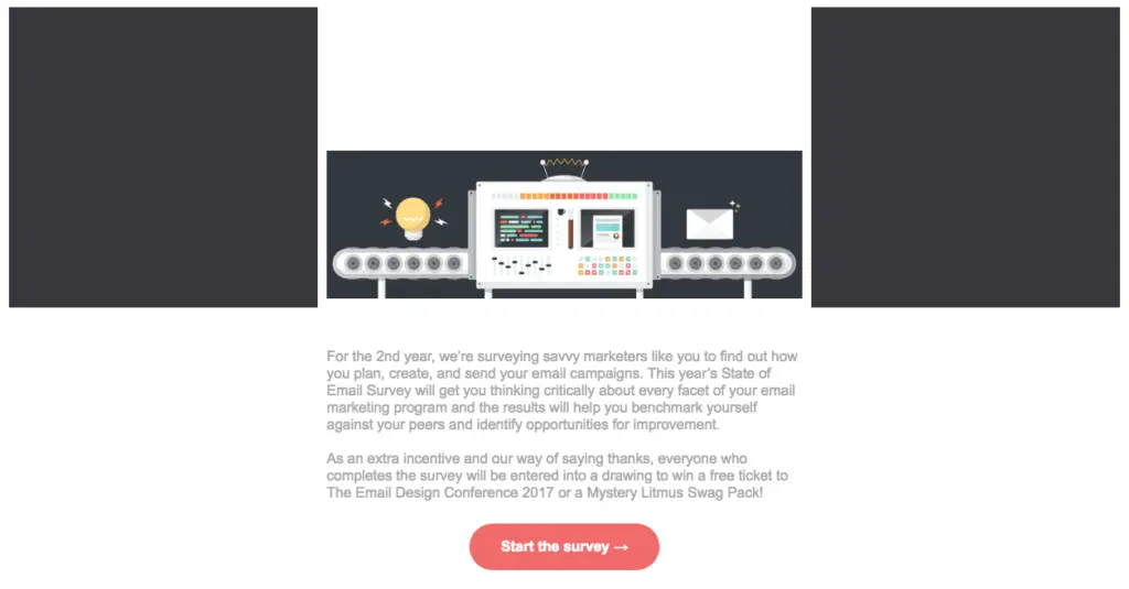
In the Beefree editor, we started with a simple single-column design. The header and body are comprised of live text, and we also added the logo, hero image, and the bulletproof button.Here's how the email looks before we include any background colors:
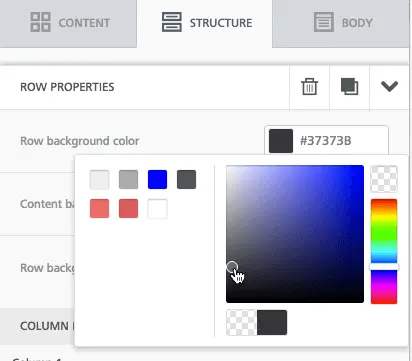
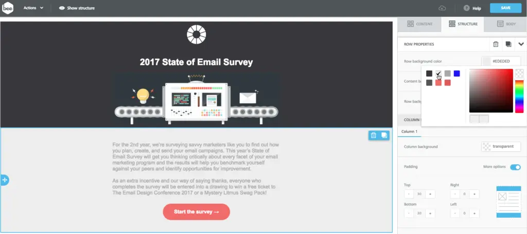
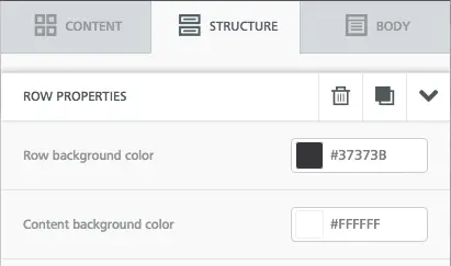
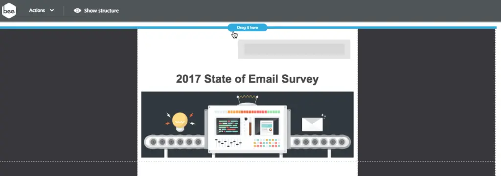
To create the full-bleed header from Litmus's original email, we simply need to edit the row and content background color settings.First, we'll simply click on the rowwe want to edit so that it's highlighted with a blue border as such:

Now, in the Structure menu to the right, we can edit the row background color and content background color.

The row background color is the color of the content structure from edge to edge, while the content background color is the background colorbehind the center column of email content. For the full-bleed look, we need only to select the row background color of our choice and leave the content background set to transparent.
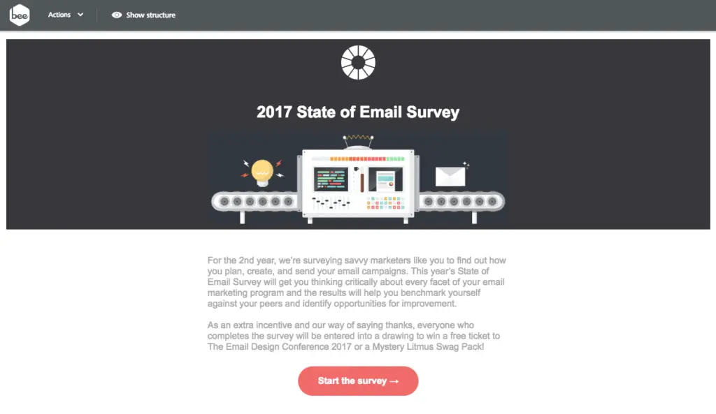
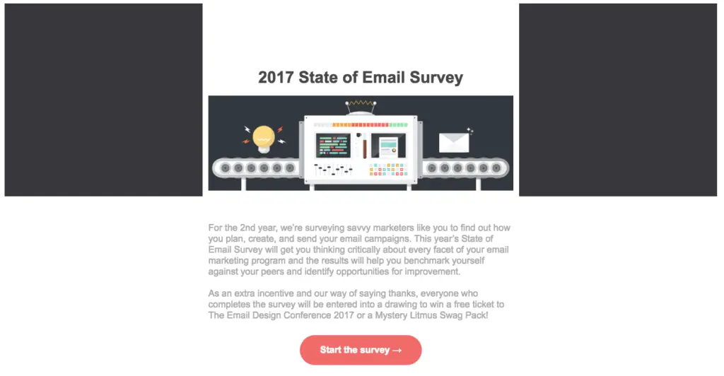
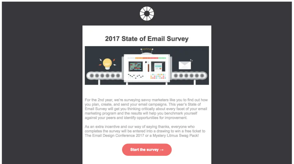
After updating the header font color to white, here's how our email looks with the new row background color:
In BEE, whenever you wantto create a full-bleed design, choose the row background color(s) of your choice, then set the content background color to transparent.The row background color can also be changed from one part of your emailto the next. In this email, for instance, we could select the second rowof content and choose a new color, like pale gray:
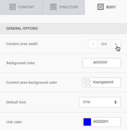
In BEE, you have a lot of flexibility when it comes to customizing color.Bonus tip:In theBody menu on the right, you can also adjust your content area width as well as the background color for the entire email at any point as you design.
How to create a boxed email design
Changing our email from a full-bleed layout to a boxed one is simple. First, select the header row once again. Go back to the Structure menu on the right, and this time, change the content background from transparent to white.Here's our updated email, before we make any other adjustments:
To complete the boxed look, we need to update the header font color...
...then update the background color in the second row to match the first:
One last trick: if we want to position the white Litmus logo against the dark gray background, we can create a new content row for just the logo, making the row background dark.Just drag in a new row acrossthe top:
Then add the logo as an image and update the background. The new lookadds to the box-effect on the body of the content.
Design your next email design layout with Beefree!
So, what do you think? Do you prefer one layout to the other? The good news is that switching one layout to the other couldn't be easier with Beefree!